Village of Curiosity | Design & Branding
.png?v=1781720596)
.png?v=1781720596)
Our Identity
The Village of Curiosity is more than a visual brand; it is the story of who we are as a school. Every colour, character and design choice reflects our belief that children learn best when they feel connected, inspired and part of something larger than themselves.
A Brand Rooted in Purpose
Our branding represents a school community that values exploration, connection and belonging. It mirrors the idea that learning is a human, relational experience one strengthened through nature, creativity and shared encounters.
How Targeted Provision Influences Our Design
The thinking behind our Village of Curiosity branding draws deeply from our wider work, including our approach to Targeted Provision. This area of school life recognises that some learners benefit from more personalised, hands-on, curiosity-driven experiences that take them beyond the classroom. These values shape our identity and help inform how we present ourselves across the school.
From the themes of connection with nature, movement, collaboration, and belonging, the brand has evolved to visually express what we believe learning should feel like.
Design Principles
Our visual identity is built around principles that support children’s learning and emotional development:
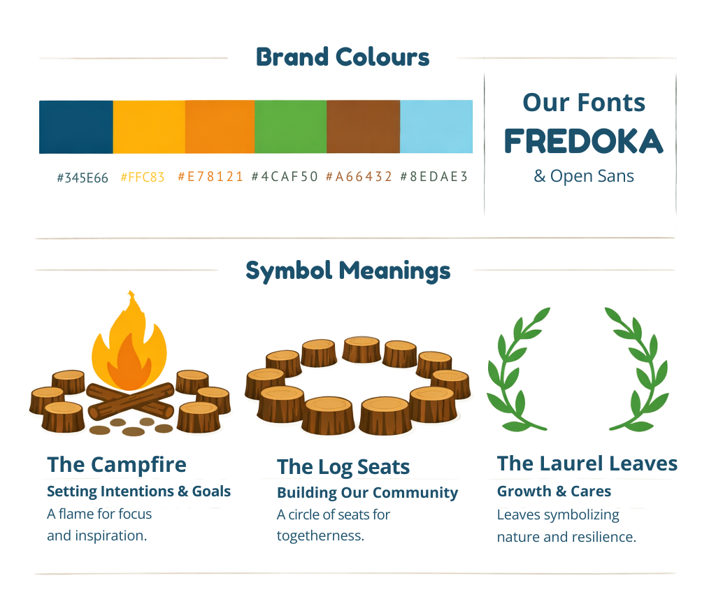
- Warm, earthy tones reflecting our connection to natural spaces.
- Illustrations inspired by community life to show that “it takes a village to raise a child.”
- Soft, rounded shapes that feel safe, friendly and familiar.
- Nature-led motifs mirroring our commitment to holistic, outdoor and experiential learning.